
Company:
Timeframe
Role:
Before I began the project, 63% of users abandoned the form at the very first step. Only 24% completed it in full.
Following my redesign, completion rates increased by 38%, with just 45% now dropping off at Step 1 and overall form completion rising to 33%.

2023 data indicated a notable decline in form completion rates, affecting the agency's ability to gain new enquiries. VSL, the top venue-finding agency in London, has recently seen a drop-off in form completion rates. The agency relies on users completing its forms as a way of getting new customers.
To optimise user engagement and maximise conversion, I was onboarded to improve the form interface to ensure seamless usability and encourage higher completion rates.
Analyse the conversion funnel to pinpoint areas where users were dropping off. By using data-driven insights in conjunction with a comprehensive UX review, you can identify specific pain points and opportunities for optimisation within the form-filling process.
The review included benchmarking, user research, product testing, wireframing, and prototyping. I collaborated with cross-functional teams, including developers and stakeholders.
Tools: Google Analytics
Using event tracking, I monitored specific interactions within the forms, such as field clicks, selections, and submissions.
I leveraged the User Flow report in Google Analytics to visualse how users navigated through the website, including points of drop-off during the form-filling process. This offered valuable insights into user behavior and abandonment paths.
We segmented website traffic by traffic source, device type, and demographics. This helped identify patterns in form abandonment across different user groups.
Additionally, we conducted A/B testing to experiment with various form designs, layouts, and messaging. This allowed us to determine which variations led to higher completion rates.

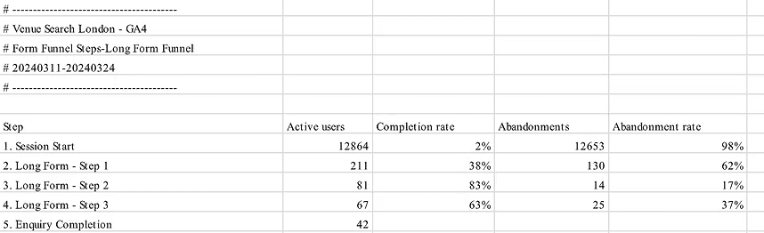
The highest abandonment rate occurs at the Session Start step, with 63% of users dropping out.
Despite this, there is a significant drop in abandonment rate from Step 1 to Step 2, indicating that a substantial portion of users who start the long form continue to Step 2.
The abandonment rates decrease as users progress through the long form, with the lowest abandonment rate of 8% at Step 2.
Out of those who reached the Enquiry Completion step, 24 users successfully completed the process.
To support my GA findings I also conducted an in-depth UX review including comprehensive benchmarking, user research, product testing, and iterative wireframing and prototyping to drive significant improvements in conversion rates
To make sure that VSL aligned with industry standards, I conducted thorough competitor research, analysing key players such as Taglondon, Venue Hire, and Hire Space.
Given the small amount of agencies currently operating in this space, it's important to mitigate client loss to competitors.
This competitor benchmarking involved comparing search functionalities and the efficiency of form-filling processes.


Tools: user testing, user interviews.
User research provides insights into user behaviours, preferences, and needs, leading to more informed decision-making and the optimisation of VSL's services to align with user expectations.
User research has proven invaluable in validating the data analysis.
For Example:
Through user interviews (despite being a small user test), it was evident that the majority of users consistently clicked on the same call-to-action button on the homepage to initiate the venue search process. As such, we can confidently propose reducing clutter on the homepage by removing the redundant second call-to-action button, thus streamlining the user experience and potentially improving funnel engagement.
Guidelines of search forms and landing pages: Baymard, Nielson Norman Group and Smashing Magazine
Findings:
It’s recommended to avoid generic CTA’s, though it could work for some well-known contexts, it can decrease specificity, therefore affecting the conversion rate. Use natural communication forms instead.
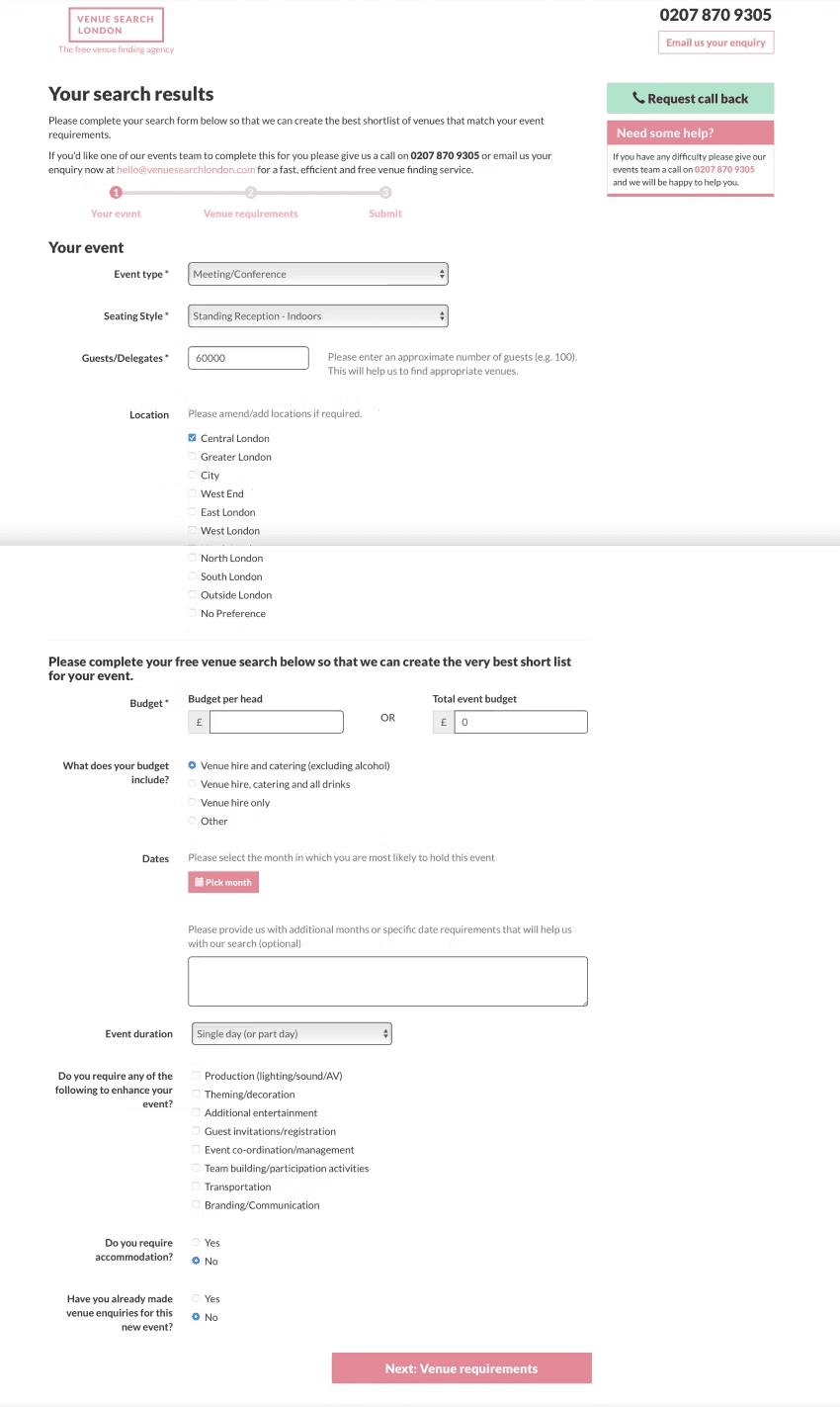
Make sure the label is above the container. This allows users to capture input labels and input text with one single eye movement, the fastest completion time
Change the input field for the budget into two steps. First, the user will select from the drop down either total event budget or budget per head, depending on selection user inputs the budget in mind with the appropriate hint text and label above the container. Progressive disclosure will illuminate confusion. Users will likely either have a total budget in mind or a per-head budget.

Once I had spent time with the current product, completed my research and gathered feedback on the aspects of the product that needed improving, I started creating low-fidelity wireframes of the forms and homepage so that I could present these back to the stakeholders.


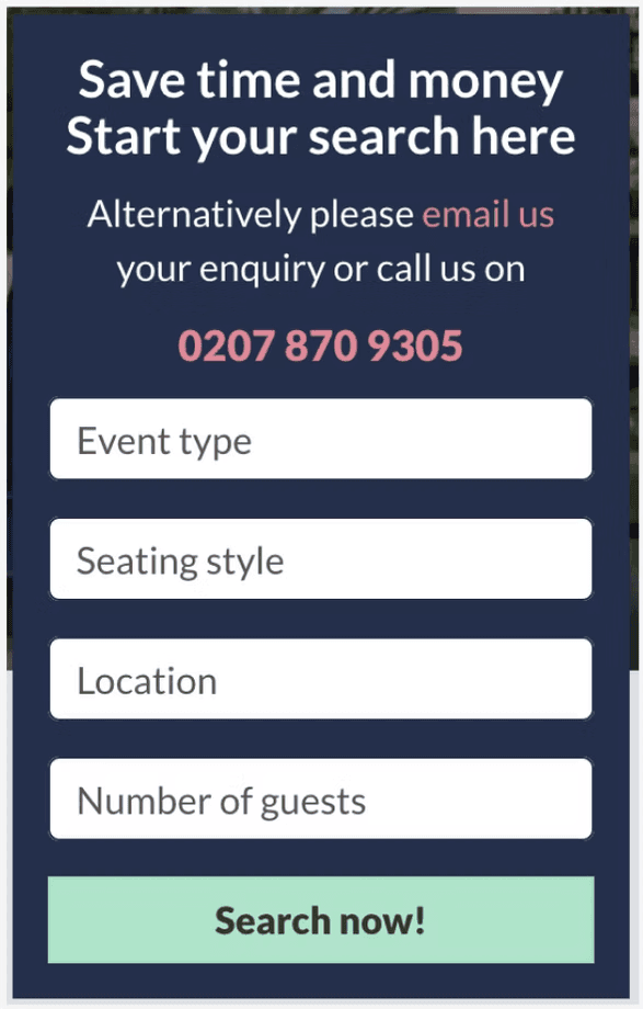
Home Page - enhancing the form completion through focused and minimalistic design
Minimised Objects and Text:
Simplifies the interface to reduce cognitive overload.
Directs user attention to the form, enhancing clarity and focus.
Fading Background During Form Input:
Creates a distraction-free environment, increasing user concentration on the form.
Establishes a clear visual hierarchy, emphasising the form's importance.
Reduced Copy:
Provides concise, essential information to avoid overwhelming users.
Eliminates distractions, making the form-filling process intuitive and straightforward.

Action-Oriented Heading:
Clear, descriptive heading like "Start your free search of +1,709 venues now" to explain the process and benefits.
Remove Repeated Contact Information:
Eliminate the number and email fields at this stage to streamline the form and focus on completion.
Alphabetical Drop-Down List:
Organise options alphabetically with the most common answer at the top for easier navigation.
Clear CTA Button:
Use explicit text like "Start free venue search" to inform users of the next step.
Smooth Transition to Stage 2:
Ensure clicking the CTA takes users to the next stage without leading them to re-enter previously provided information.

Label Positioning:
Place labels above input fields for quick and easy readability.
Hint Text Placement:
Position hint text below input fields for clear guidance.
Field Marking:
Mark mandatory fields with an asterisk (*) and optional fields with "(optional)" for clarity.
Section Titles:
Group related tasks under clear section titles for better context and easier scanning.
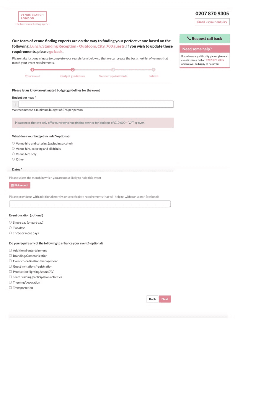
Progress Tracker:
Make the progress tracker larger and centrally positioned for better visibility. The user will always know how long to go.
Budget Input Improvement:
Use a two-step input for the budget (either per head or total). Progressive disclosure will illuminate confusion. Users will likely either have a total budget in mind or a per-head budget.
Form Simplification:
Shorten and simplify the form for quicker completion.
Back Button:
Add a 'Back' CTA to allow users to update prefilled information easily.
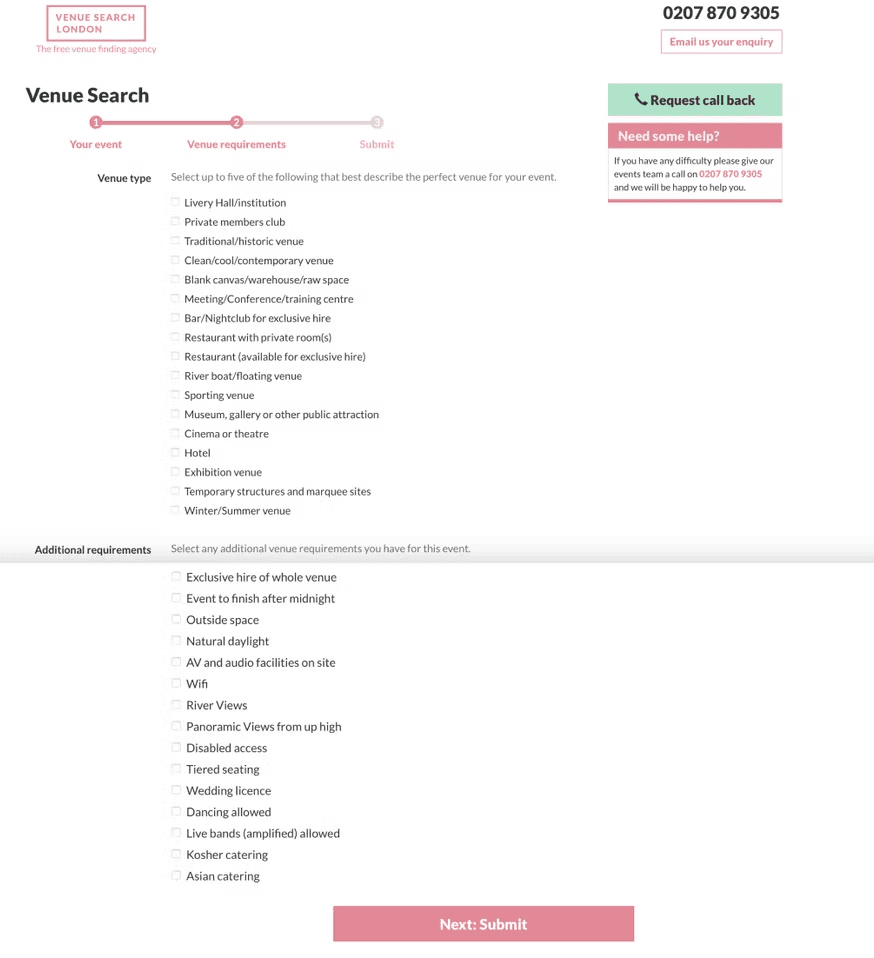
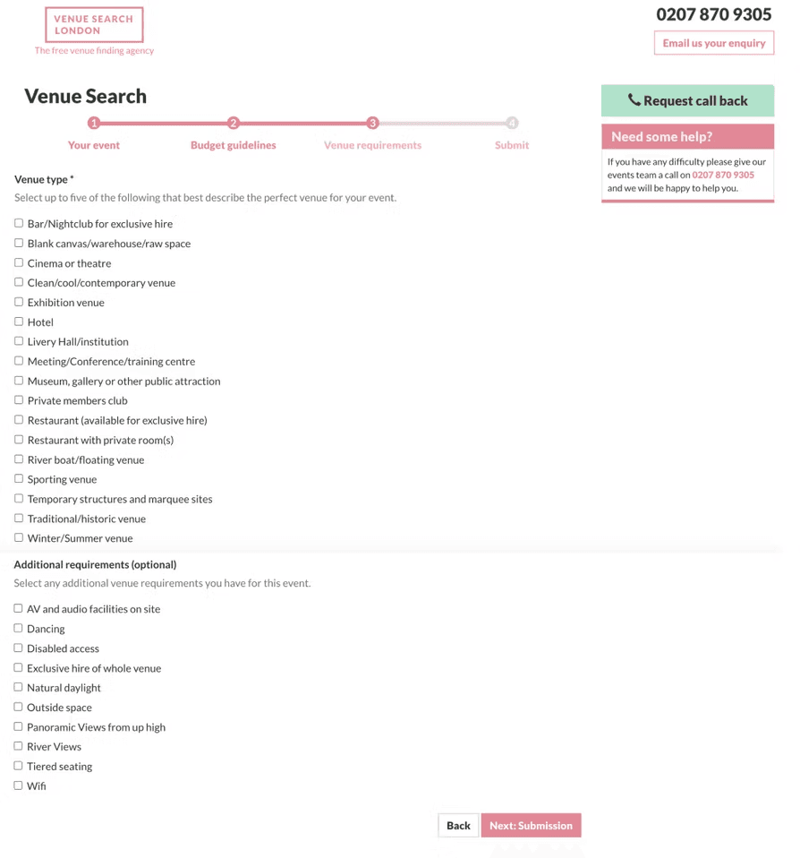
Organised List:
Arrange the list alphabetically, with the most common options pre-selected at the top.
Field Requirements:
Clearly mark venue type and additional requirements as either optional or required.
Single Name Field:
Change to a single 'Full Name' input for simplicity.
Phone Hint Text and data instructions:
Place text inside an information icon, remove text on the screen
Back Button:
Add a 'Back' CTA for easy navigation.

