
The Plan:
Create a logical and user-friendly structure to facilitate navigation, allowing users to easily find what they are looking for
Deliverables:
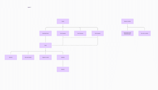
A site map structured with primary, secondary and tertiary content to improve navigation to align to key user journeys.
Report with summary of insights from interviewing stakeholders
Benchmarking report with summary of peer analysis with recommendations to AFME on direction
Export of workshop content
Benchmarking:
Conduct a comprehensive comparison of peers in a similar industry to assess how they handle similar challenges and problems. Based on this analysis, provide well-informed recommendations on the strategic direction AFME should take to improve their website and overall user experience.
User interviews:
Prepare a discussion guide to facilitate interviews with key stakeholders. These interviews aim to gather insights on the objectives of the website redesign, constraints, existing issues, and AFMEs priorities. Understanding these aspects is crucial for aligning the redesign with AFME’s overall goals and objectives of their redesign. Run a prioritisation session to playback these insights to make sure the priorities of stakeholders are aligned and agreed.
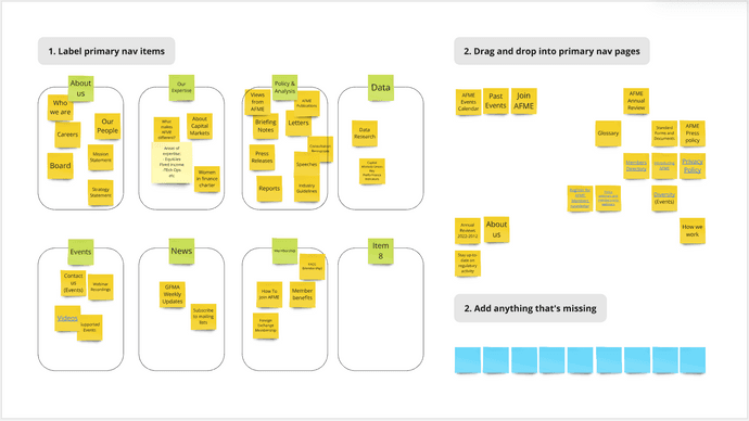
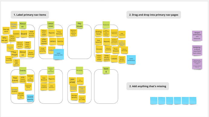
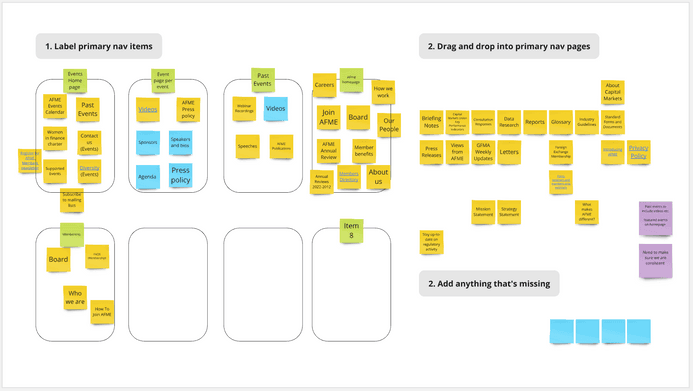
Workshopping:
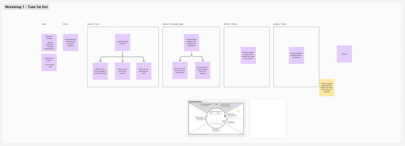
Organise and run a series of workshops, each focused on understanding the needs and pain points of key user personas. Collaborate with key stakeholders during these workshops to create empathy maps and customer journeys for each persona. These workshops will provide essential insights that form the foundation for making informed suggestions
Ideation:
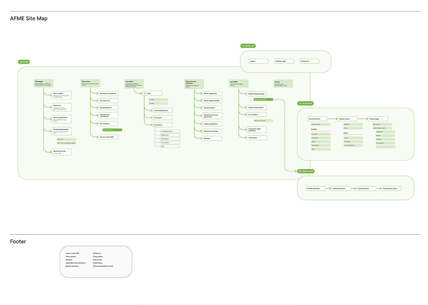
Produce a structured site map that includes primary, secondary, and tertiary content. This site map should align with key user journeys, ensuring that it is organised in a way that meets user needs and enhances the overall user experience.
I conducted a peer review to benchmark AFME against industry standards, identifying strengths and opportunities to improve the UX. The review assessed peers against best practices for user experience, using expert knowledge and current digital trends to score performance in key areas:
Visual Design:
The aesthetic quality and effectiveness of visual design elements.
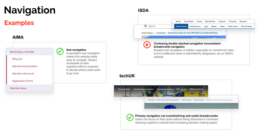
Navigation:
The intuitiveness and ease of navigating the site.
Membership Process:
The visibility of sign-up options and the efficiency of the application process.
Information Architecture:
The structure and organisation of content, including layout, headings, labels, and overall usability.


The review revealed a diverse range of observations.
Peers like ICMA and ISDA provided extensive content and technical expertise, but face challengesin presenting this information in an accessible and user-friendly manner.
On the other hand, peers such as EBF adopted a more visually engaging approach. However,despite their playful designs, they struggle with ensuring good text contrast and usable navigation,falling short in implementing best practices for intuitive interfaces and effective informationarchitecture.
While insightful, the review did not evaluate content, accessibility, or tone of voice, and user pain points remain unknown, requiring further research to validate findings.


Participants:
We interviewed 5* key stakeholders. These stakeholders represented departments including Events, Capital Markets, Membership & Events, Advocacy, and the C-Suite.
Interview Structure:
Each interview lasted 45 minutes with a moderator leading the interview, and an observer taking notes to ensure all feedback was captured as the interview was in progress.
Preparation and Format:
Interviews were conducted online. A brief discussion guide was shared with participants beforehand to ensure they were prepared for the conversation.
Objectives:
We explored the stakeholders’ expectations for the website, their goals, pain points, and technical constraints.
*Ideally, I would have conducted interviews with a broader range of users to gather more comprehensive insights, but the scope was constrained by the client’s budget limitations.

Summary:
Despite the diversity of departments—including Events, Capital Markets, Advocacy, and the C-Suite—a common vision emerged for a better user experience through a modern design, enhanced accessibility, and streamlined navigation.
Key Issues:
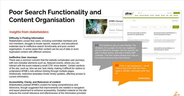
Poor Search Functionality and Content Organisation: Ineffective search tools make it hard for users to find relevant information. Disorganised and duplicated content leads to frustration.
Underutilised Membership Portal: The membership section is underdeveloped, offering minimal value and engagement opportunities for members
Event Management Limitations: Lack of functionalities like session registration, sponsorship value and event detail


Engaged Stakeholder:
Who are they? A senior representative from a European bank, possibly in a regulatory or compliance role. They are a full or associate member of AFME, using AFME as a platform to voice their stance on financial regulation. Their organisation wants to influence financial regulation in Europe, and they look to AFME for guidance, data, and support.
Goals:
Access relevant reports and data on financial regulation changes over the last year or more.
Stay informed about AFME’s positions on various issues to align with their organization’s stance.
Be active within AFME’s network by collaborating in committees and working groups.
Flag problems or raise concerns regarding financial regulations.
Challenges:
Difficulty navigating the website to find the reports and publications they need.
The website's search function doesn’t allow keyword or date-based searches, making it time-consuming to locate past publications.
Confusion regarding their involvement in working groups, including knowing which groups they or their colleagues are a part of.
Difficulty or inability to update personal and role details on the platform.
What do they need?
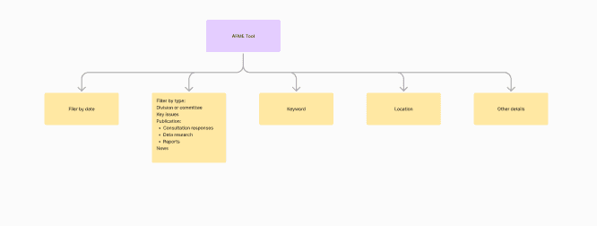
Enhanced search functionality with a better algorithm, filters (e.g., by division), and regularly updated content, with outdated content removed or content that doesn’t expire.
Transparency about their application status for events or updates to their member profile.
A system to track participation in working groups and manage updates for both themselves and their colleagues.
A reduction in the number of emails from AFME, especially if they are part of multiple working groups.
Hopes and Gains:
To feel that their voice is represented clearly through AFME, and that their involvement is visible (e.g., being listed on boards or committees).
To reduce the time spent on administrative tasks like updating their details or registering for events, thanks to automation and better UX.
To have an easy-to-navigate member area with access to content relevant to them.
Curious Visitor:
Who are they? A diverse set of individuals who interact with AFME for various purposes, including prospective members from banks, regulators, policy makers, academics, event sponsors, media partners, and prospective technology providers. They are curious about AFME’s work, looking for information, attending events, or exploring membership benefits. Many have limited prior exposure to AFME and come from public, private, or academic sectors.
Goals:
Learn more about AFME’s mission and the benefits of becoming a member.
Access data, reports, policy papers, or contact information that will support their research or professional role.
Understand which companies are members of AFME and what initiatives the organization supports.
Explore career opportunities within AFME.
Challenges:
Difficulty with understanding quickly and reliably who AFME are and what their positions on key topics are, and why it matters.
Registering for events can feel cumbersome due to unnecessary steps, such as requiring passwords or manual input for multiple attendees.
Confusion from jargon and inconsistent organization of information across the site, making it difficult to determine what AFME’s key messages or initiatives are.
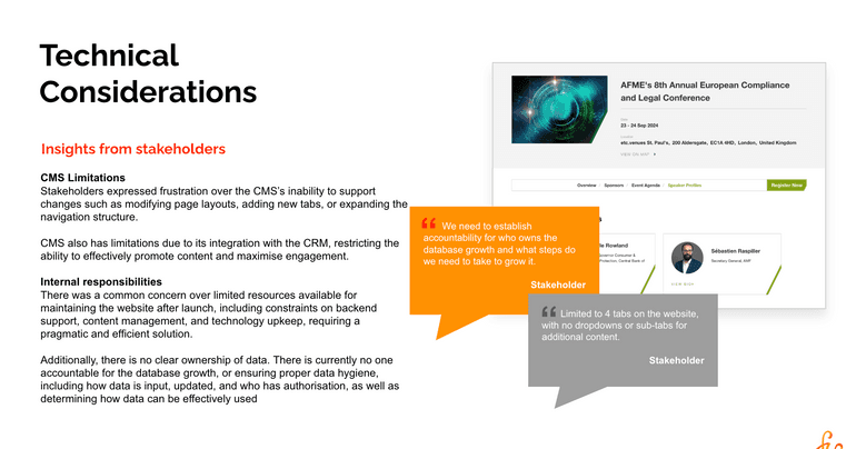
(Sponsor) The events team's difficulty in promoting events before, during, and after due to CMS limitations, leading to less value for the sponsor's money.
What do they need?
Clear information about the benefits of AFME membership, membership packages, how to join, and that it is a corporate membership.
A more intuitive, better-structured, user-friendly website that allows them to easily navigate for information.
Easy access to key event information, such as travel options, accommodation, and the ability to view sessions a speaker is involved in.
Hopes and Gains:
A clearer understanding of what AFME stands for and how they can engage with the organization, whether as a potential member, visitor, or prospective employee.
A user-friendly, logical website that allows them to find information quickly and easily.
Shared
Goals:
Access data, reports, or policy papers.
Register for AFME events and connect with other members.
Register for AFME events and access webinar recordings or downloadable resources.
Challenges:
Confusion about where key resources, such as reports or event registration, are located.
Accessibility issues, including lack of intuitive navigation, excessive jargon, and inaccessibility for members with disabilities such as Dyslexia or visual impairments.
Difficulty navigating the website to find relevant information, particularly due to clunky search functions and illogical categorization.
Frustration with the outdated, static nature of the site, where updated content is not easily accessible.
Accessibility issues for users with visual impairments or specific needs, like larger font sizes or better audio support.
What do they need?
A smoother, more intuitive registration process for events, with fewer barriers like unnecessary passwords.
Clear, easy access to resources like reports, policy papers, data, and event information.
What do they see?
Poor formatting on smaller screens, making some content like speaker profiles difficult to view.
What do they feel?
Frustrated by the inefficiency and clunkiness of the website, especially when it takes too long to find what they need.
Frustrated by the inefficiency of the website, particularly the search functionality, clunky navigation, and inconsistent content.
Uncertain about how to access the information they need without direct assistance, leading them to seek information through other channels like direct emails.
Hopes and Gaines:
A user-friendly, logical website that allows them to find information quickly and easily.
Improved accessibility, with features like better font size options, clearer headings, and audio prompts for visually impaired users.
Easier access to relevant content like reports, agendas, and recordings without needing to jump through extra steps.


This project presented several challenges, particularly in aligning the client's expectations with established UX best practices. The client was highly involved in the process, which, while valuable in some ways, limited my ability to guide the process and decisions as the UX expert.
User Interviews: Ideally, we would have conducted at least 25 interviews with end-users of the website and membership portal. However, due to time and budget constraints, we interviewed AFME employees instead. While this provided some insights, it introduced potential biases and preconceived ideas, impacting the objectivity of our findings.
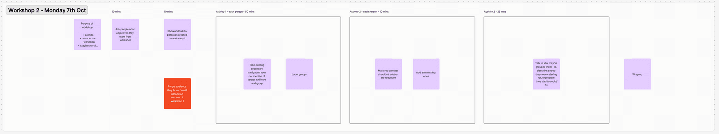
Workshops: The workshops were a missed opportunity to build robust personas and develop meaningful empathy and customer journey maps—key foundations for a successful website redesign. However, the client prioritised creating a site map, and the workshops were consequently focused on understanding the current navigation and content structure. While this provided a practical outcome, it limited our ability to fully explore user needs and behaviours. Starting the redesign process with a site map rather than a deeper understanding of the users' journeys felt misaligned with best practices. Nevertheless, we moved forward with this approach to meet the client’s objectives.
We’ve aimed to capture as many of the identified issues as possible in the site map. However, some of the concerns raised were a bit difficult to fully represent in this format.
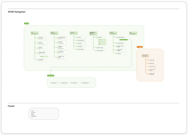
Our overall recommendation is to streamline the number of navigation items and place greater emphasis on content that highlights AFME's identity and positioning.
Since search functionality is a key pain point for users when it comes to finding research and publications, we’ve recommended implementing an enhanced search tool. This, coupled with featuring recent publications prominently on the homepage, should significantly improve the relevance and accessibility of information for users.
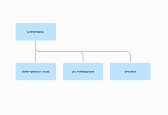
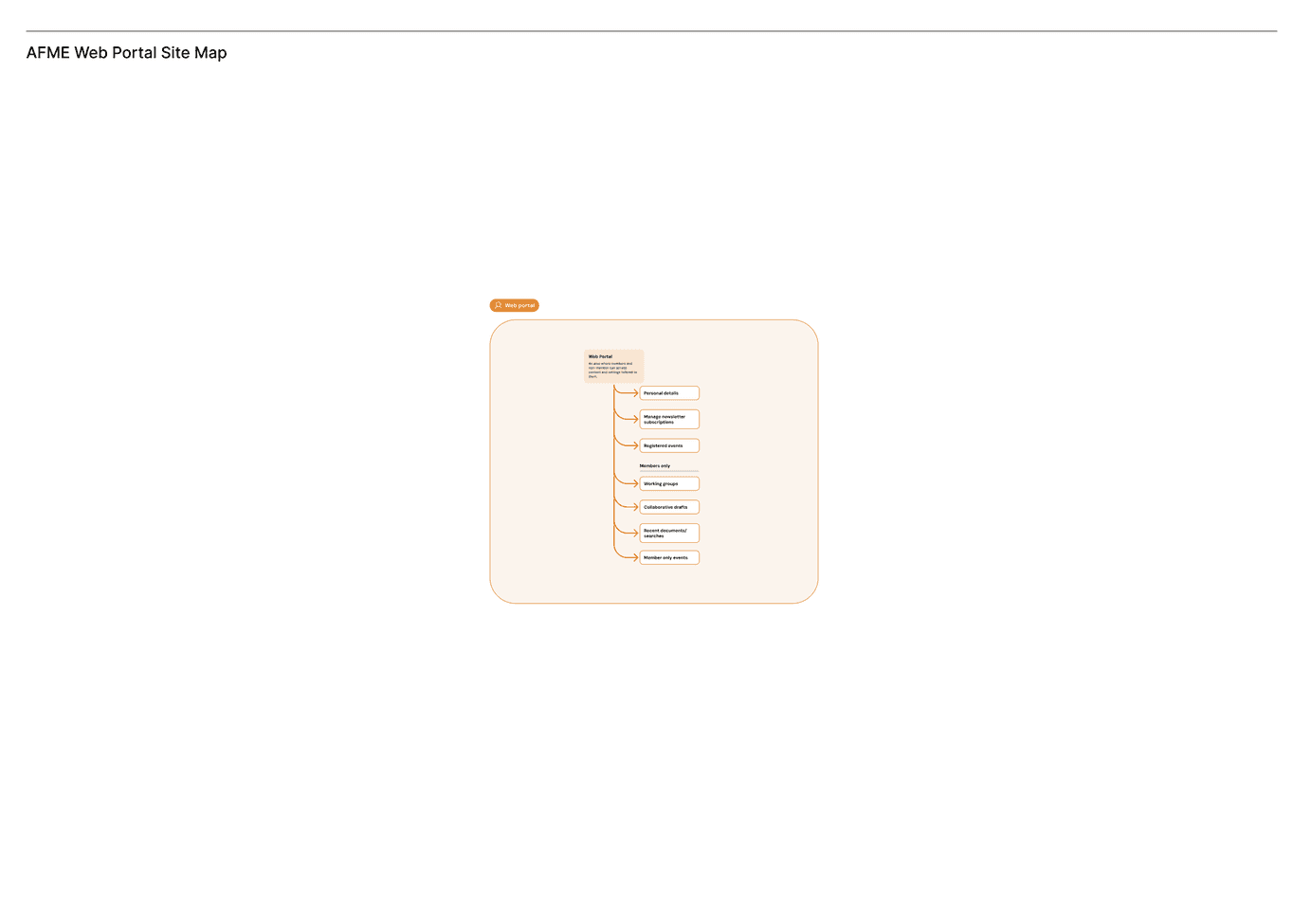
Additionally, we’ve included a suggestion for a more personalised member portal. This would allow members to easily access working groups they are part of, as well as any documents they’re collaborating on with AFME, making the experience more user-friendly and efficient.
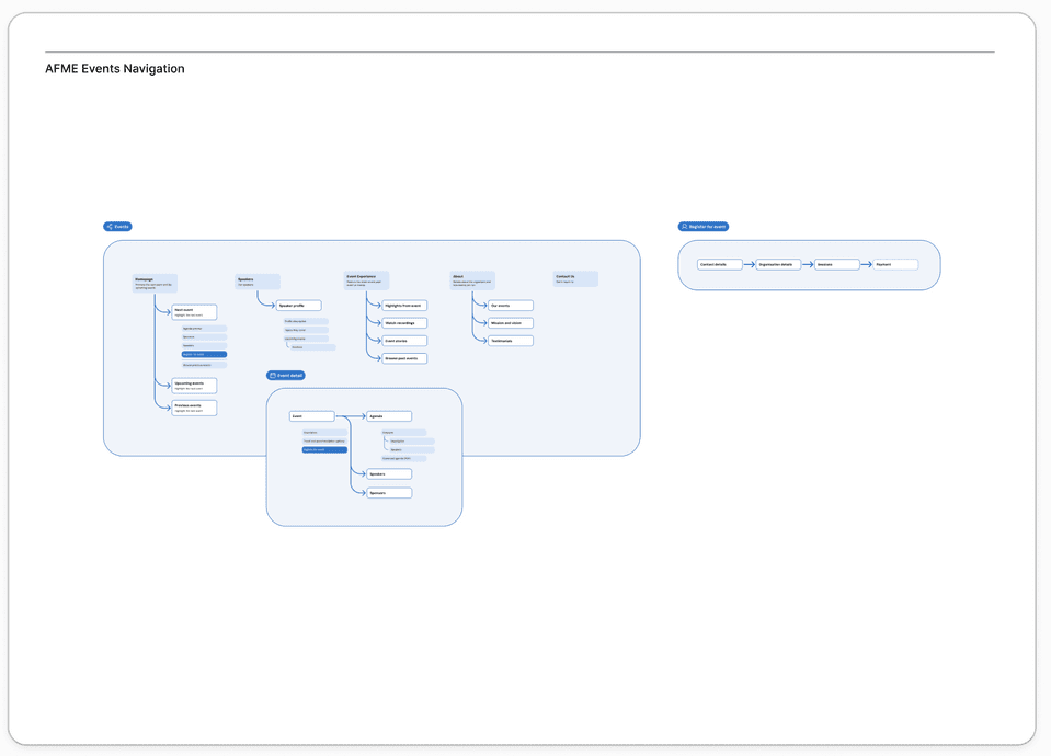
Lastly, we’ve proposed exploring whether the events section should become a standalone website (accessible through the primary navigation.). This would allow a more focused navigation for events, given the volume of content, and create opportunities to tailor the branding to suit the nature of the events. However, this is just a suggestion, and it could alternatively remain a sub-page of the current site, similar to its current structure.